Mike Taylor lives by his tagline: Ask. Learn. Share. He curates the best resources to optimize learning and shares them to his tens of thousands of followers on social media.
When he’s not sharing his insights and discoveries online, he runs workshops, speaks at conferences, and teaches graduate level students learning design and technology. You can only imagine the work needed to successfully manage all these projects. So as a self-confessed “lazy guy,” he’s always on the lookout for ways to streamline his processes.
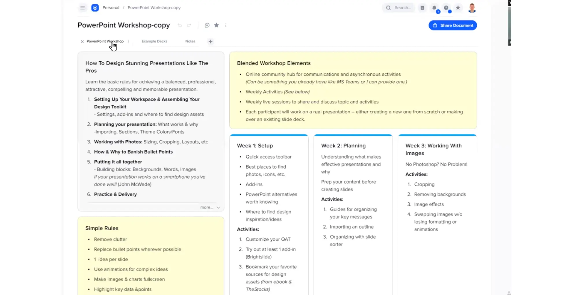
When Mike first used xTiles, he found the tool that would change the way he curated and shared resources with others.
“xTiles is a great tool for curation. When I’m doing a talk, a workshop, or a course, I can easily add slide decks, videos, notes, links, and resources in one place. I like it so much that I’m slowly retiring other tools I’ve used before.”
Summary
Streamlining Instructional Design
Engaging workshops and lessons don’t just appear out of thin air – even for a veteran teacher and learning consultant like Mike.
In fact, he calls the beginnings of his process “a big blob of mess.” That’s because he starts workshop development and lesson planning with an info dump – capturing random ideas and resources from various places.
“It usually starts as a seed of an idea. From there I start gathering more details. This part can be very messy as I add in various types of snippets, videos, and insights I think will be cool to share.”
The challenge for many educators is in stitching these different ideas together to maximize student learning. How do you distill multiple ideas and resources and make them accessible to your students who are already overwhelmed with information?
Mike states:
“I used to use bookmarking tools or Google Doc for curation. But bookmarks were very limiting because I couldn’t add insights or commentary about the resources. As for Google Doc, it’s not really that flexible when you’re constantly moving and shifting things around.”
Then Mike discovered xTiles.
When I first tried it, I was immediately able to combine text, images, and links and then sorted all these different things together very quickly, too. I loved how I could easily organize what I’d curated. There’s nothing I had ever found that gave me this much flexibility and control.”
Moreover, it’s not only easy for Mike to curate information but it’s also designed for easy sharing with other people.
“One of the things I really like xTiles for is that after I’ve curated all resources on one page, I can easily share that page. Everyone gets a copy of it and they immediately have access to it for their own consumption.”

Optimizing Learning by Minimizing Friction
As an educator, Mike is constantly working against the dark forces of constant distraction. That’s why he’s always looking for ways to capture students’ attention and spark their enthusiasm for learning. One of the ways he does this is by minimizing friction.
“In my experience, it takes a very small amount of friction for people to give up and walk away. So I try to eliminate as much friction as possible so that they get what I want them to get as quickly and as easily as possible.”
xTiles has helped him with this mission. By having one place where he can add all resources and insights in a clear and structured way, students don’t have to work as hard.
“At the end of the day, what we’re trying to do as educators is get people’s attention. And when we’ve got that attention, we’re getting them to do something in a different way. Having a tool like xTiles makes this whole process easier.”
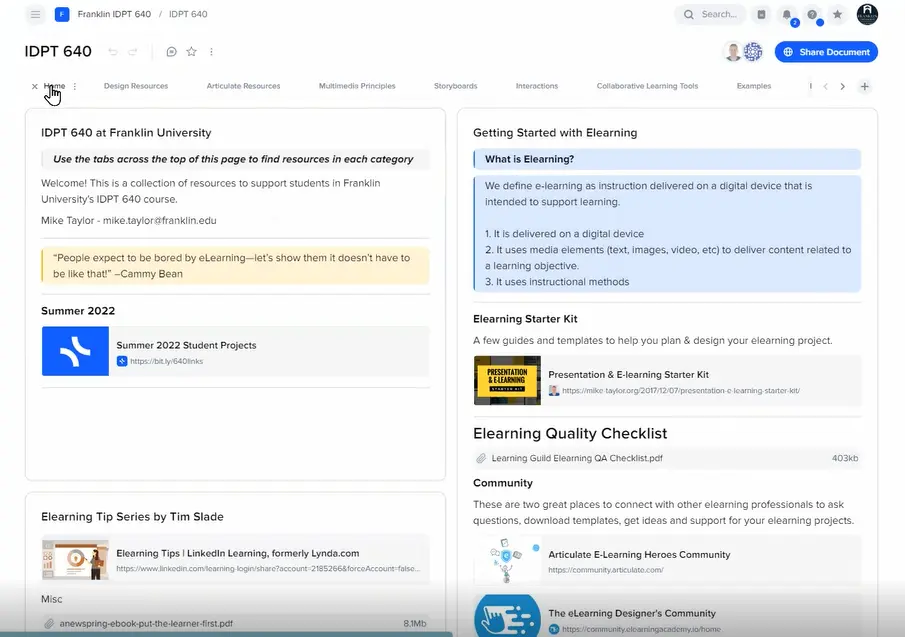
In his graduate class, for example, Mike uses xTiles to catalog resources that are not on the official course page. This means the students get additional information that reinforces their understanding of the topic.

Students have reacted enthusiastically to Mike’s xTiles pages. Not only are the resources ready for their immediate use but they’re also presented in a way that’s very easy to consume.
“How the end-product looks matters. It’s not enough to have helpful resources. You also want them to be visually appealing. If you don’t have a visually appealing output, people will have doubts about its credibility. And they’ll even discount what you’re trying to convey. So it matters a lot what it looks like.”
Showcasing Student Projects in One Place
For Mike, xTiles is not only a curation tool. It’s also an online web page for sharing and collaboration.
As such, he also uses xTiles as a place to post his students’ work so that everyone in the class can see it.
“I teach a graduate level class in eLearning instructional design and I use xTiles for showcasing student work. I use the tabs to put their assignments in and we share that in the class so they can all see each other’s work.”
As the course moves along throughout the semester, Mike regularly adds projects and tools to the document. This becomes an all-in-one guide for students.This saves them time as they don’t have to dig through a mountain of files and folders to find the resource they need. And because Mike can add links as well as embed videos and slide decks, the students can also conveniently study the material at their leisure.
“We have an official page for the course. But then there are all these extra things that students ask about that are not included there. I drop those extra resources on xTiles. Students seem to really like having them organized like that.”
Another benefit is that compared to official websites which take a long time to get updated, students always get the most current version of the page.
“Over time, I keep adding to and updating the page. I may update the text, add a new resource, or remove some stuff. Students always have access to the updated version. I also like that instead of giving them a list of 150 bookmarks — which are not very user-friendly — I have them all in this one place that’s visually appealing and easy to navigate.”


