Productivity has always been a cornerstone of human progress. The invention of paper, books, typewriters, and ultimately computers—all were created to manage our knowledge and memory better, leading to timely and well-informed decisions that drive success in whatever process we are involved in.
Personal productivity can be divided into several specific use cases: note-taking, planning, task management, project management, brainstorming, and collaboration with others—be it team members, clients, or students.
There are several tools that serve each of these use cases well. For example:
- Apple Notes, Google Keep, or Evernote for note-taking,
- Todoist, Any.do, Reminders for task management,
- Miro, Whimsical for brainstorming,
- ClickUp, Asana for project management,
- Google Calendar for time planning.
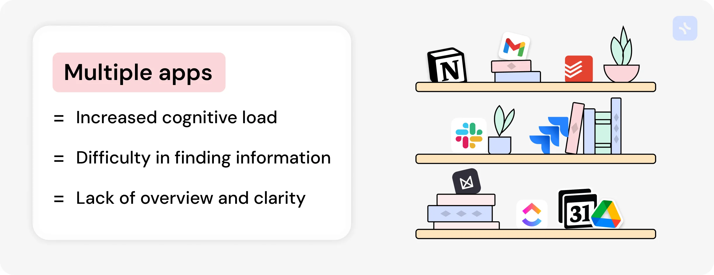
However, scattering information across different applications can be counterproductive, increasing cognitive load, complicating the search for necessary information, and preventing a clear overview of the current state of affairs.
Some applications combine multiple functions simultaneously, such as notes and tasks in Evernote or task and project management in Todoist. However, more is needed. Regarding team-oriented applications, there are more comprehensive tools like ClickUp, Monday, Coda.io, and, of course, Notion.
Notion stands out among all applications because it is equally good for teams and personal use. Although there are significant drawbacks associated with personal use, it must be acknowledged that Notion is the undisputed leader in the all-in-one tools market for personal productivity.
Why is Notion so good, and what does it offer?
Notion provides a workspace that combines documents and databases. Documents are traditional vertical structures with a block system, meaning each paragraph, image, or table is a block. Notion offers various blocks beyond just text, such as tables, quotes, embeds, and other types. Blocks can be moved around within a document, making data organization convenient.
On the other hand, databases allow you to create organized data sets and display them in various formats like tables, kanban boards, calendars, galleries, or timelines. This is useful for creating CRM systems, task lists, employee directories, and more. Like in a classic relational database, Notion allows linking databases together through special property types, simplifying the structure and navigation of a knowledge base.
The key attraction for users is the flexibility to customize the structure according to their needs from scratch or by using ready-made templates. This customization is Notion killer feature, allowing users to design their productivity system to fit their personal or professional style. This has become increasingly important as users seek a comfortable workspace where they can fully realize their productivity.
Notion is growing rapidly, with recent reports showing that over 100,000 new users register daily—a testament to people’s desire to enhance their productivity using Notion flexible approach.
But is everything really that good?
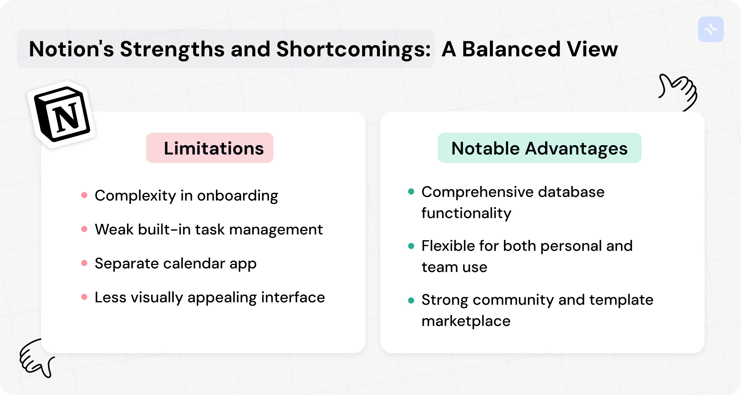
While Notion offers first-class functionality, it has two significant problems:
- In recent years, Notion has focused exclusively on teams, becoming more like the monstrous ClickUp or Monday and losing the simplicity initially attracting millions of users.
- Even in its earlier, lighter versions, Notion has always been somewhat difficult to start with. The main reason is that you must first organize the database structure before you can unlock Notion full potential.
These are the two fundamental issues with Notion. There are also other less critical but still painful problems for users, such as:
- Weak built-in task management.
- A separate calendar app (Cron) instead of an integrated one within Notion.
- A weak mobile app.
- An inconvenient structure for project-based work.
- A dull, gray interface lacking in visual appeal and aesthetics.
Despite these shortcomings, Notion has no real competitors. No other application allows users to create their own productivity system with the same level of freedom. All other tools either lack sufficient flexibility or are so team-oriented that individual users cannot tolerate the overload of unnecessary features.
However, as often happens in the market, good position doesn’t remain empty for long. Notion now faces a worthy competitor that matches it in flexibility and functionality—xTiles.
xTiles is, like Notion, an all-in-one productivity tool designed to be the user’s one central location for all kinds of tasks, their daily tool, and productivity assistant.
xTiles is much younger than Notion, founded in 2021, while Notion dates back to 2013. Naturally, xTiles currently has a significantly smaller user base. However, in terms of functionality, you will find much of what Notion offers, and more importantly, xTiles has several substantial and unique distinguishing features. Let’s take a closer look at them.
xTiles-Notion general comparison
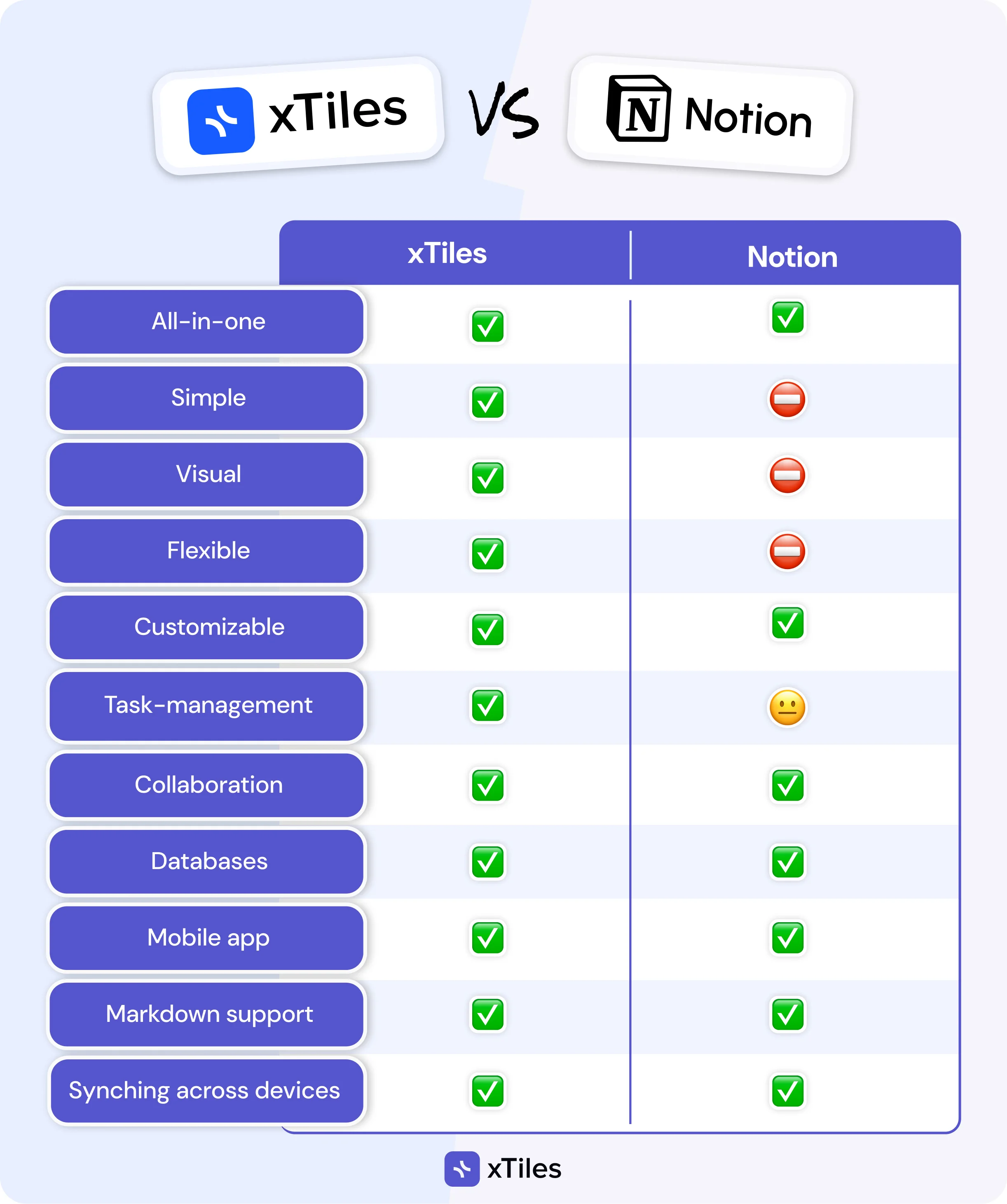
When comparing the general functionality and approach to onboarding, it’s evident that xTiles places a greater emphasis on individual user productivity. Cases like planning, personal task management, and note-taking are implemented more effectively in xTiles, while Notion excels in database functionality needed for teams and offers many useful integrations with team tools.
The same applies to templates; xTiles has well-developed individual templates, while Notion excels in team templates. However, these two platforms can be used for personal and team purposes, which sets them apart from other productivity applications.
Pages
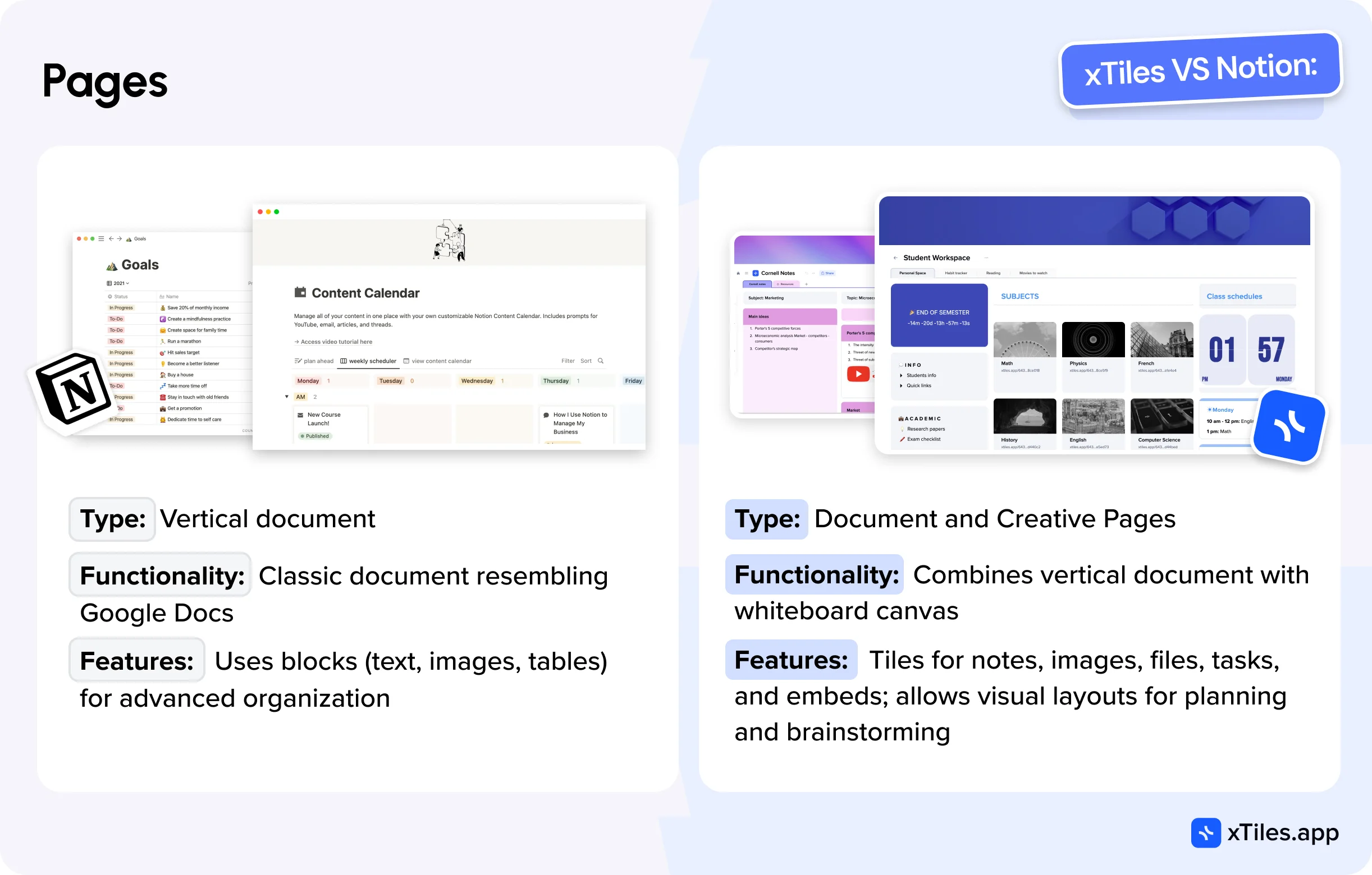
Notion has one type of page—a classic vertical document that visually resembles Google Docs but is more advanced in functionality due to the use of blocks and their variety.
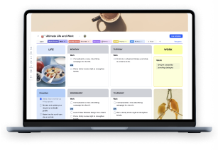
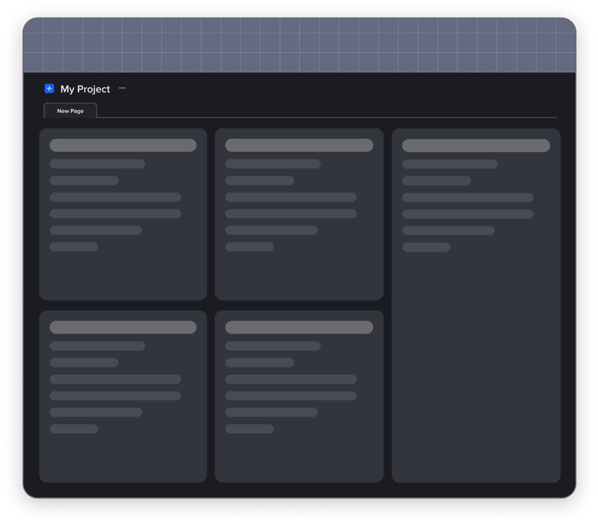
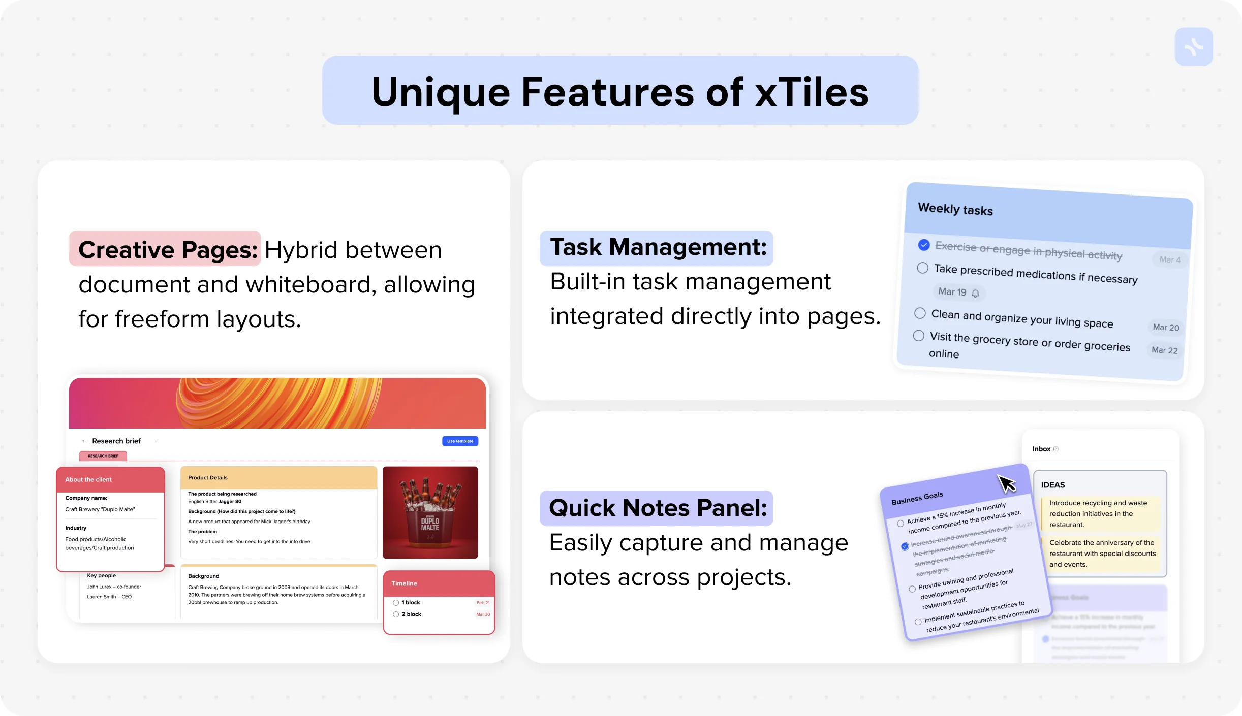
xTiles also has a document-type page, which is very similar to Notion. However, xTiles introduces a unique type of page—the creative page. This is a fascinating hybrid of a vertical document and a whiteboard canvas. xTiles allows you to create tiles on creative pages, which can resemble sticky notes or blocks in Miro.
Tiles can contain the same types of blocks as a document page, such as text, images, files, tasks, embeds, and more. The ability to move and resize tiles enables the creation of visual layouts that are much better suited for planning, brainstorming, and research. Ultimately, the interface for working with a creative page feels like building a webpage in a website builder, but with a much simpler interface and less effort.
Creative pages are a powerful and extremely useful feature of xTiles, providing users with a much greater sense of freedom than Notion documents. Moreover, they look visually appealing, offering emotional satisfaction from work and motivating users to maintain their productivity systems. Creative pages, thanks to different layout combinations and more advanced styling options look more varied and dynamic than Notion documents.
Note-taking
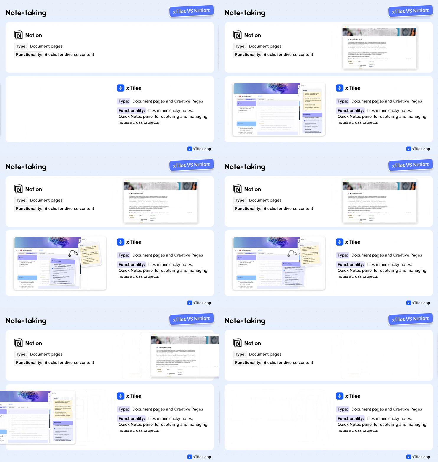
For note-taking, Notion again offers document-type pages. A wide variety of blocks allows for easy inclusion of diverse content. However, this still feels like a document in both size and format. It becomes less convenient when dealing with compact notes of a few sentences or small lists. Although Notion allows you to arrange blocks in multiple columns, this can be cumbersome and doesn’t solve the problem of typical small notes.
xTiles offers more variety here. You can use the Notion approach with a document-type page, but xTiles users often prefer creative pages, where you can use tiles that mimic sticky notes and create an entire board of notes. These can later be structured by drag-and-drop interface within the page or document, offering more flexibility than in Notion.
Additionally, xTiles has a separate Quick Notes panel that is unbound to any project and available across the user’s account. This panel has two purposes: to collect notes that should always be at hand and to serve as a capture feed, as it also appears in the mobile app and allows quick sharing of texts or links from other apps, as well as adding photos or audio notes. Tiles from this panel can be dragged onto any project page, enabling efficient backlog management and note structuring.
Task management
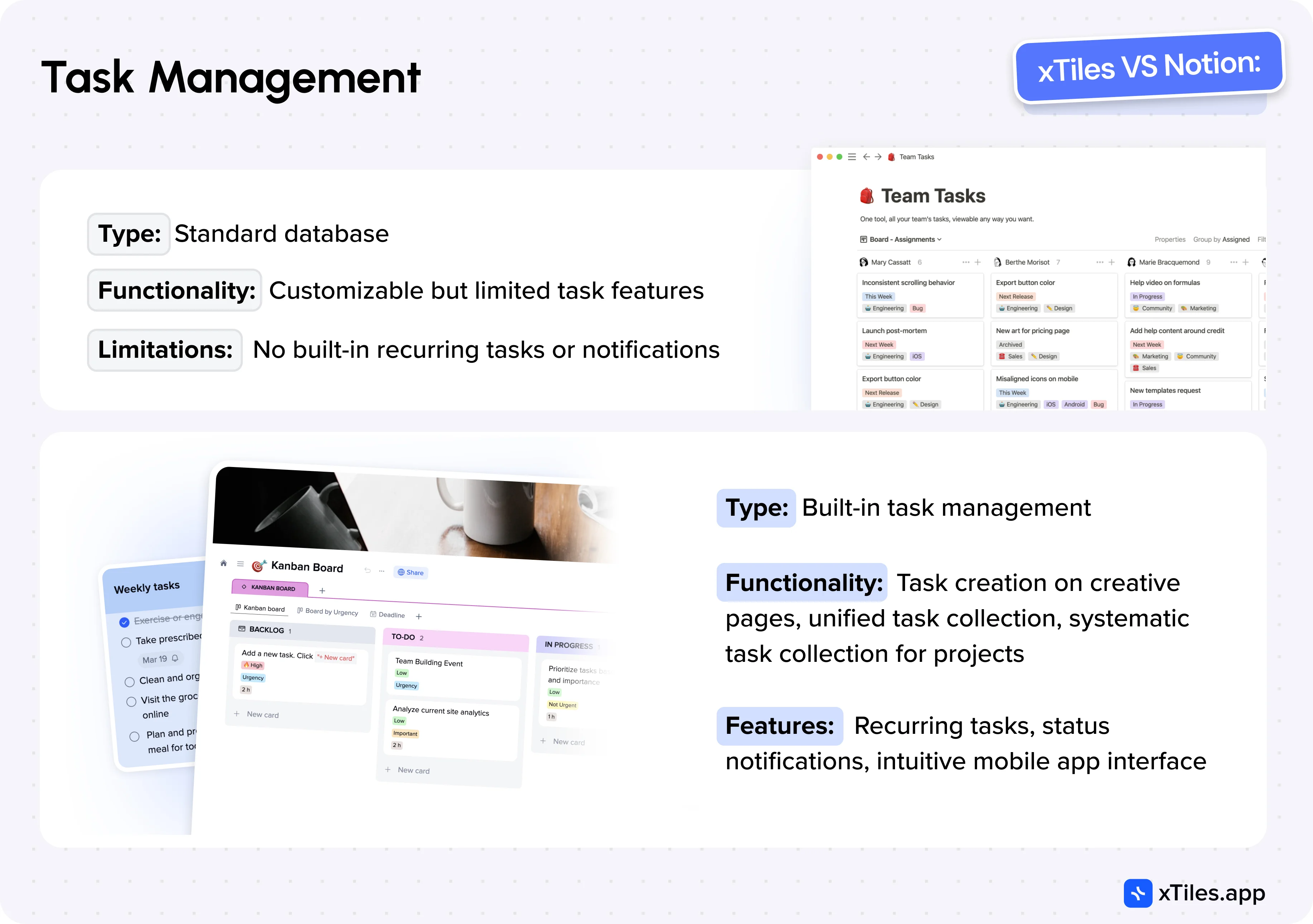
Until recently, Notion didn’t have built-in task management, and the only way to organize tasks was by creating a standard database specifically tailored for task management. You could customize it by adding various properties, but the capabilities could have been improved, making it impossible to set up recurring tasks or notifications, for example.
Now, Notion has slightly improved this by introducing a dedicated “Tasks” database with some task-specific features. However, this hasn’t dramatically changed the situation, as mobile task management remains inconvenient, and common features expected in a personal task management tool are still lacking.
xTiles, on the other hand, offers built-in task management that is more akin to familiar tools like Apple Reminders or Todoist but is deeply integrated into pages and collections. Here are some key differences from Notion:
- Task Creation on Creative Pages: xTiles allows you to create tasks directly on creative pages or documents, while a special block type is absent in Notion. This is incredibly convenient as you can intertwine tasks, notes, and various resources on a single page, creating a clear picture of your project.
- Unified Task Collection: xTiles features a task sidebar where all personal tasks from all your pages are collected and grouped by day. You can also create tasks directly in this panel, allowing you to manage all your tasks centrally. This same panel is available in the mobile app, with a user experience that closely resembles classic task management apps and is intuitive and familiar to most users.
- Systematic Task Collection for Projects: Each xTiles project can have a systematic task collection that is convenient for both personal and team use, though its impact is more significant in team collaboration. This task collection acts as a control panel for project managers, gathering tasks from all project pages assigned to different team members, allowing centralized management of statuses and priorities. It includes built-in properties like Due Date and Assign, but you can add custom properties for grouping, filtering, and sorting by specific project attributes.
xTiles includes all the usual task features, such as recurring tasks and status or assignee change notifications. In summary, xTiles task management functionality is significantly more advanced and truly meets the needs of both personal and team use, which is a substantial advantage.
Integrated Google Calendar
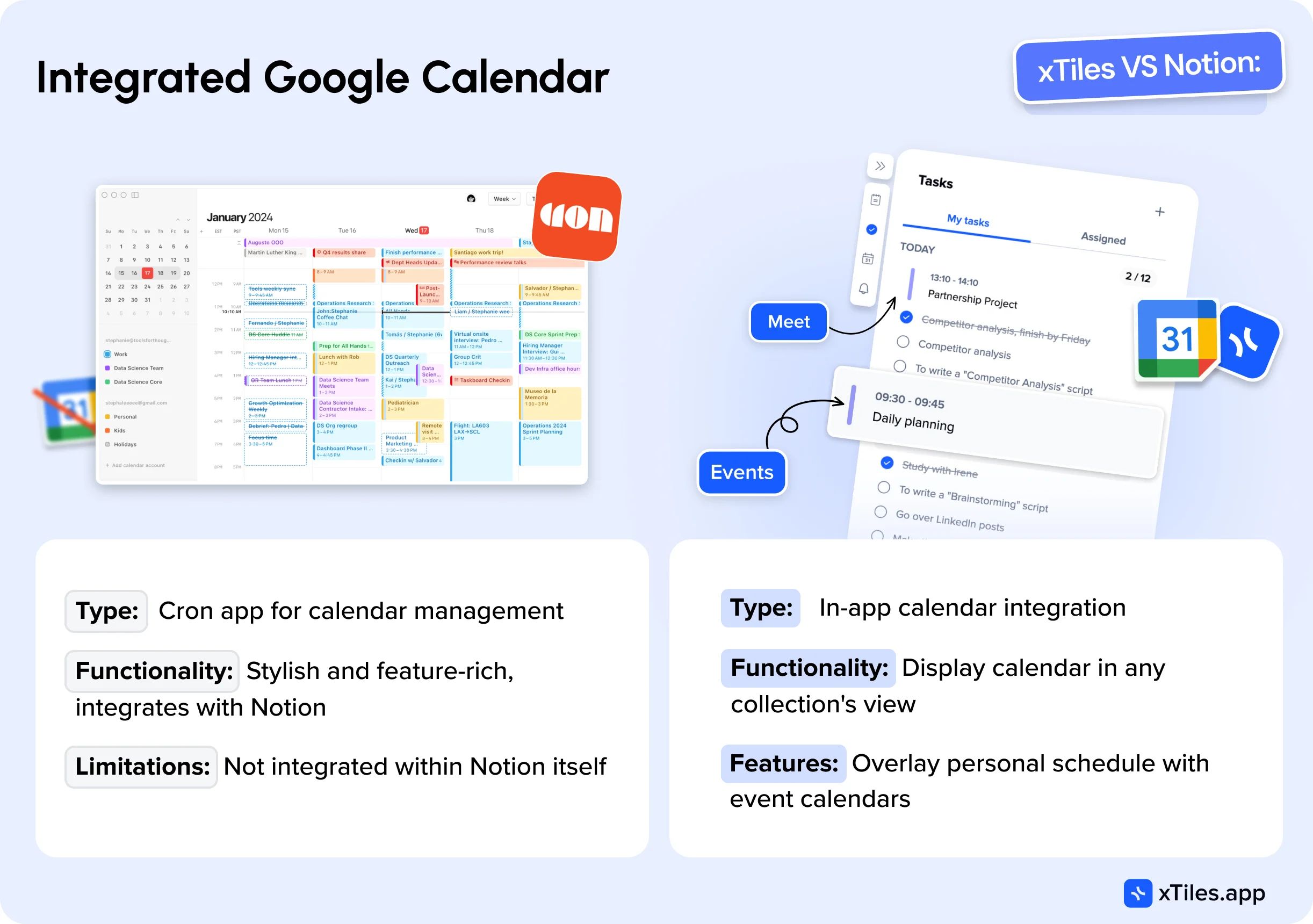
Recently, Notion introduced a separate app for calendar management called Cron. It’s a stylish and well-developed app that avoids many of Google Calendar’s issues while offering several additional useful features, such as automatically creating links for video meetings or displaying participants’ schedules to find the optimal time. It integrates with Notion, allowing you to attach pages from your knowledge base to events, which is quite convenient. However, it’s worth noting that Cron is not the only good calendar management app available.
xTiles takes a different approach, offering in-app calendar integration. One of the significant advantages of xTiles is the ability to display your calendar in any collection’s calendar view, allowing you to overlay your own schedule onto another event calendar.
Collections vs. Databases
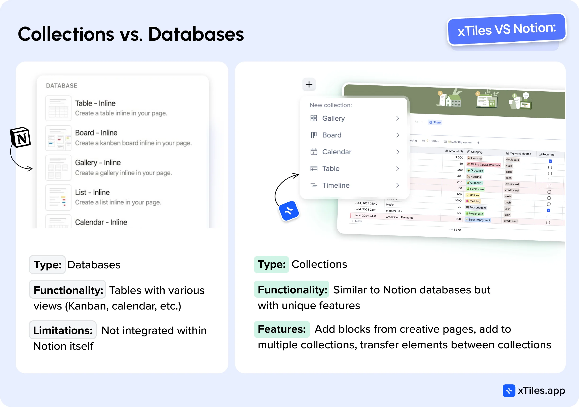
One of the Notion most prominent features is undoubtedly its databases. The release of Notion 2.0, which highlighted databases, fueled its rise to popularity, and it remains a core feature used by almost all Notion users. Databases are essentially tables with columns that can be visually represented in different views, such as tables, Kanban boards, calendars, galleries, or timelines.
Previously, users mainly created such tables in Excel or its cloud-based counterpart, Google Sheets. However, with the advent of Notion and other table management tools like AirTable or Coda.io, a new approach emerged, allowing tables to be typed using properties of different types (text, number, date, etc.). Additionally, these tables could be transformed into other views, such as Kanban or calendar views, using select or date fields, respectively.
Moreover, the ability to link tables, similar to relational databases, enabled the creation of fully-fledged mini-applications like CRM systems, project management systems, or personnel management systems. This functionality is now familiar to many users. While Notion may not be the undisputed leader in databases—AirTable and Coda have their advantages—it has largely set the standard in this area.
As for xTiles, it has renamed its databases as “Collections,” which may initially seem like mere rebranding. However, upon closer inspection, the term “Collections” appears more accurate and appropriate. xTiles collections closely resemble Notion databases in basic functionality, offering almost all the same views (except Gantt, though it’s on the roadmap) and nearly all the same property types. Visually, they look quite similar, with differences in design and style, but these are not functional differences.
Сritical differences between xTiles Collections and Notion Databases
1. Adding Blocks from Creative Pages
You can add blocks or tiles from creative pages or document pages to a collection in xTiles. This is a game-changing feature, as it allows you to engage in creative work—brainstorming or planning—and simultaneously add the necessary blocks to the appropriate collections without leaving the context. This significantly simplifies the creation of a knowledge base and reduces cognitive load by minimizing context switching. Additionally, you can see which blocks have already been added to collections, saving you time and ensuring you don’t forget to take important actions.
2. Adding an Element to Multiple Collections
You can add an element to both the Library collection and the Read Later collection in xTiles, allowing you to read an interesting article at your convenience and save it in your general resource collection simultaneously. This is just one example of many use cases, and this feature provides much greater flexibility than Notion approach.
3. Transferring Elements Between Collections
This feature may seem simple, but its importance shouldn’t be underestimated. One of Notion problems is creating the perfect structure, which users are unlikely to know in advance.Transferring data from one database to another is impossible in Notion, while xTiles allows you to split the data of one table into two or three new ones or, conversely, merge them.
Structure
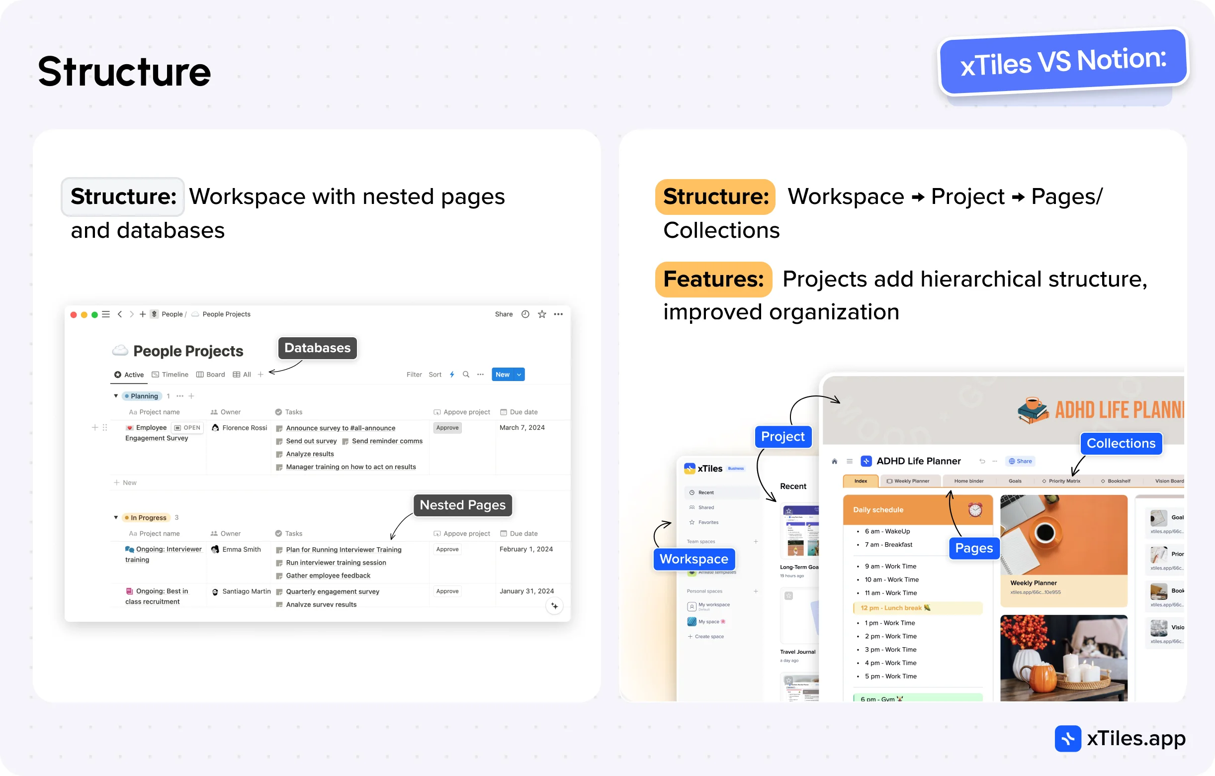
Notion structure is relatively simple: a Workspace containing pages and databases. Pages can be nested within each other, and that’s about it.
xTiles offers a slightly more complex structure that provides greater flexibility and convenience in certain use cases: Workspace -> Project -> Pages/Collections. The key difference here is the introduction of a new entity, the Project.
What do Projects offer? First, they provide another level of hierarchy, allowing you to structure your data better. A project can be a module in your productivity system—for example, you could have Projects for Product, HR, or CRM for your team. Secondly, a project can represent a separate client project or a specific activity you want to isolate.
Importantly, collections created within a project don’t get mixed up with others, allowing you to properly structure your workspace, whereas in Notion, collections appear as a continuous list on the left panel. Projects are particularly useful for agencies, freelancers, consultants, and others who work on a project-by-project basis.
Additionally, xTiles pages navigation is located at the top, allowing the entire workspace to occupy the screen’s width. This is especially important on laptops, enabling you to see the big picture of your idea/task/project without scrolling.
Mobile app
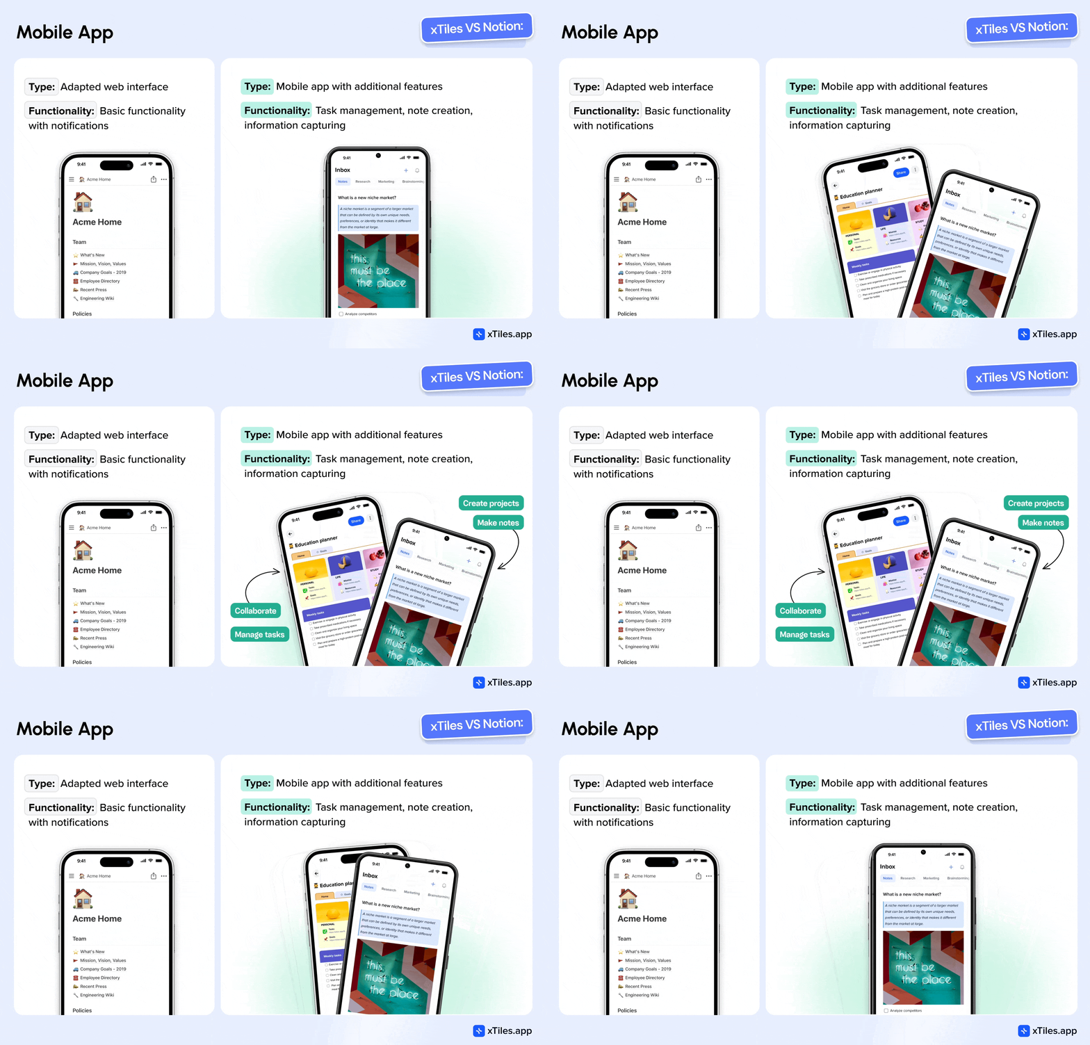
Notion mobile app is essentially the web interface, slightly adapted for mobile display, plus notifications. Many Notion users are openly dissatisfied with it.
xTiles also provides access to projects, essentially mirroring the web interface, but this is a secondary feature.
The three main functions of the xTiles mobile app are:
- Task Management and Checking: With an interface similar to classic task management apps, you get almost Todoist in one of the tabs.
- Note Creation: With an interface similar to Google Keep or Craft, simple yet powerful.
- Information Capturing: The ability to share text, links, and images from other apps, such as from a web browser to xTiles. Additionally, the ability to create notes with the camera or audio notes.
Pricing
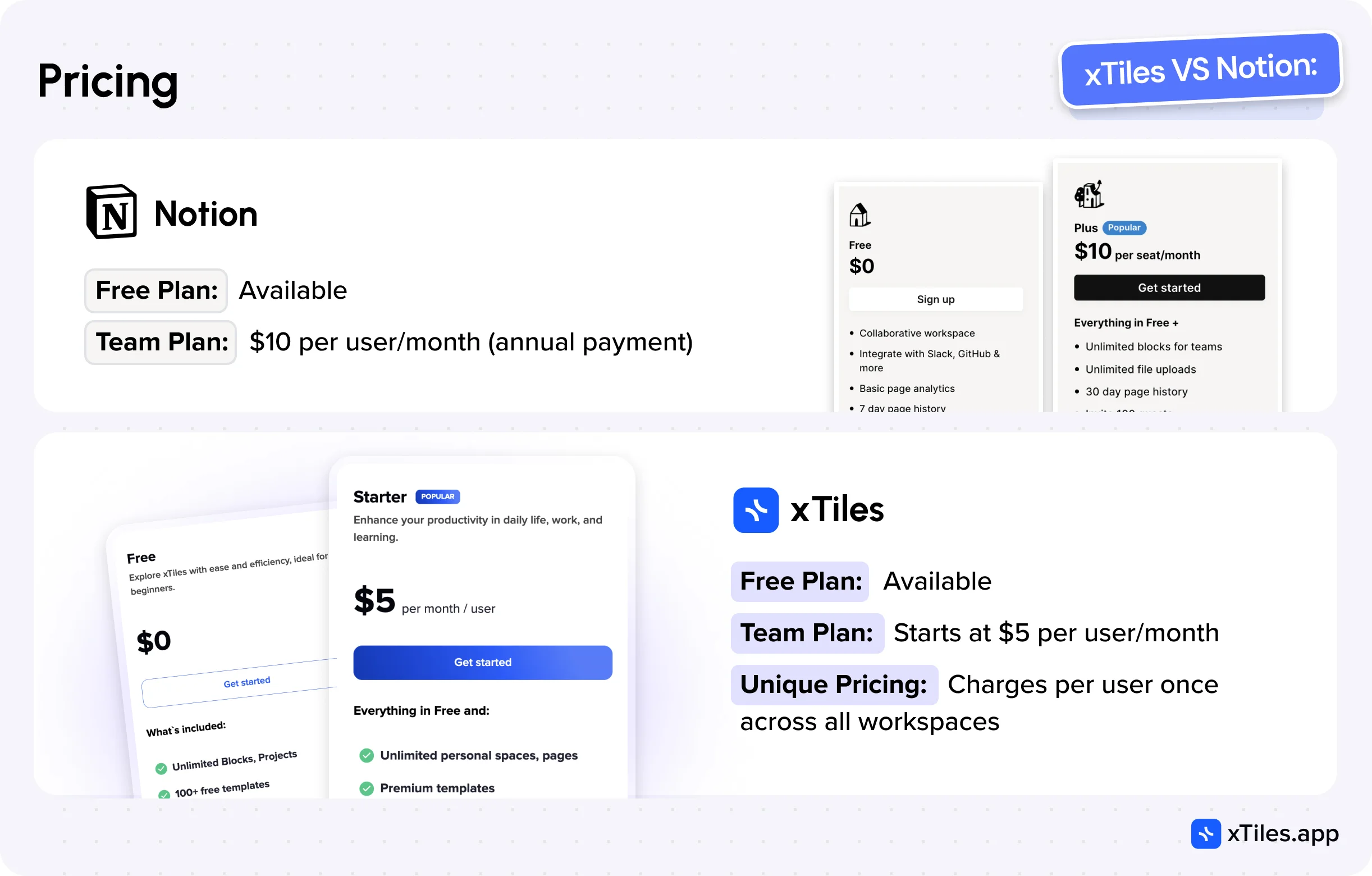
Both, xTiles and Notion offer a free plan for users to get to know them. This is the right choice when a person need to test software or plan to use it very little.
The cost of a subscription may be less of a concern for personal use but becomes more critical for teams as the price multiplies across 10, 20, or 50 team members.
Notion offers the cheapest team plan at $10 per user per month with annual payment, while xTiles starts at $5. The difference is two fold, and that’s significant.
However, the difference can be even more substantial. xTiles offers a fundamentally different pricing model for members in team workspaces. Notion charges for each user in each workspace, so if you’re part of multiple teams (multiple workspaces), you’ll have to pay the full $10 (or more with the Business plan) multiple times.
In contrast, xTiles charges for each user only once, regardless of whether the user pays for themselves or the company pays for them; they get the benefits of their paid plan across all workspaces they participate in. This is a truly unique pricing approach in collaborative productivity tools.
Notion versus xTiles: verdict
xTiles and Notion are versatile cross-platform programs for taking notes, setting tasks, and working in teams. However, their users follow different paths. xTiles has a clean and clear user interface, and the onboarding process takes little time to load. The tool stands out for its flexibility and adaptive note-taking, task and project planning, and real-time collaboration. The astounding Inbox, where users can save all kinds of data for later use, eases data storage and organization.
Apps like Notion offer great functionality for note-taking, personal wikis, planning, etc., yet with many more settings standing between you and the purpose you need the app for. Notion alternatives often provide similar capabilities with variations in design, ease of use, and specific features. Notion users have the luxury of using a built-in AI assistant that works similarly to ChatGPT, saving them time on content creation, editing, research, etc. However, who knows, maybe by the time you read this, xTiles will have launched their AI assistant, too.
xTiles is most suitable for use by employees working on a project basis. Agencies, freelancers, consultants, and other project-oriented workers may find xTiles project-centric organization, flexible task management, and visual layout more aligned with their workflow. The ability to clearly separate different client projects, coupled with robust task tracking and creative planning features, provides a tailored experience for these users. This focus on project-based work sets xTiles apart from Notion alternative tools with a more general-purpose approach, potentially making it a more attractive option for professionals in these fields.
When you choose xTiles, you get new answers to old questions:
- If you’re ready to transform how things get done now, then wait no more! Quite often, overcomplication of an idea is not the best approach when simplification can be effective.
- If you think that starting with Notion takes too much time and effort, or if you think that finding the needed template is too complicated, xTiles offers you an unchallenging start with creative pages and easy templates like Weekly Planner.
- If you think that working with databases is something from quantum physics, xTiles gives you a simplified version of databases – Collections.
- If you need or want to assign tasks with multiple properties to your teammates or yourself, xTiles gives you tasks and a calendar that is separate from the main features, so you don’t have to come up with ideas on how to create common tasks through tools that weren’t created for this purpose.
FAQ
How do xTiles and Notion differ in terms of ease of use?
xTiles offers an intuitive interface with a quick setup, allowing users to start working within minutes of registration. Notion has a steeper learning curve and may require days to set up effectively.
Which platform is better for visual organization?
Depending on the user’s preferences and requirements. xTiles excels in visual organization with its tile-based system and vertical canvas. Notion offers a more minimalist design with limited visual customization options.
How do the collaboration features compare between xTiles and Notion?
xTiles provides seamless real-time collaboration with features like editing, commenting, and reactions. Notion allows collaboration, but collaborative work doesn’t match the experience personal use offers.
Does either platform offer an integrated calendar?
xTiles has a built-in calendar with Google Calendar integration. Notion lacks an integrated calendar and requires users to use a separate Notion Calendar app.
